Some watch brands are so famous, they need no introduction. But do you know the stories behind some of the biggest watch companies in the world? This week, we’re breaking down some of the logos from around the world.
Breguet
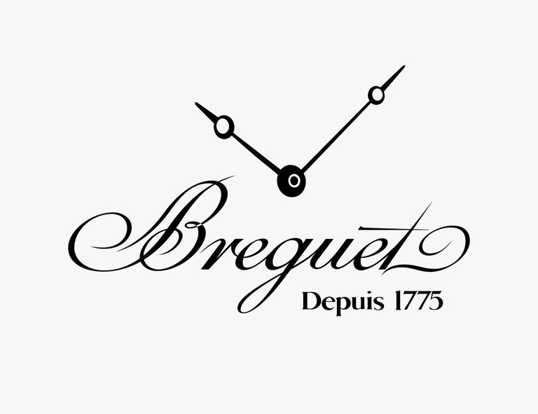
Abraham Louis Breguet founded his eponymous brand in 1775 and is one of the most significant and influential watchmakers in history, having invented everything from the tourbillon to the style of watch hands you see represented in the brand’s modern logo — they’re called pomme or Breguet hands. It’s an elegant style that’s been used by many brands since. As a logo, however, the Breguet hands are a more recent development for the company and were part of a branding refresh after joining the Swatch Group in 1999.
Breitling
A “B” for Breitling formed from the stem of an anchor and flanked by wings. Breitling is known for its sport watches. The wings resonate in particular because of the brand’s long history and association with aviation. Although pilot’s watches are the brand’s strong suit, the anchor reminds us that Breitling is aiming for land, air and sea and has some solid dive watches, as well. The logo has changed over the years, and the looping font of the “B” recalls earlier cursive typefaces that were a bit harder to read than the current sans-serif Breitling wordmark.
Longines
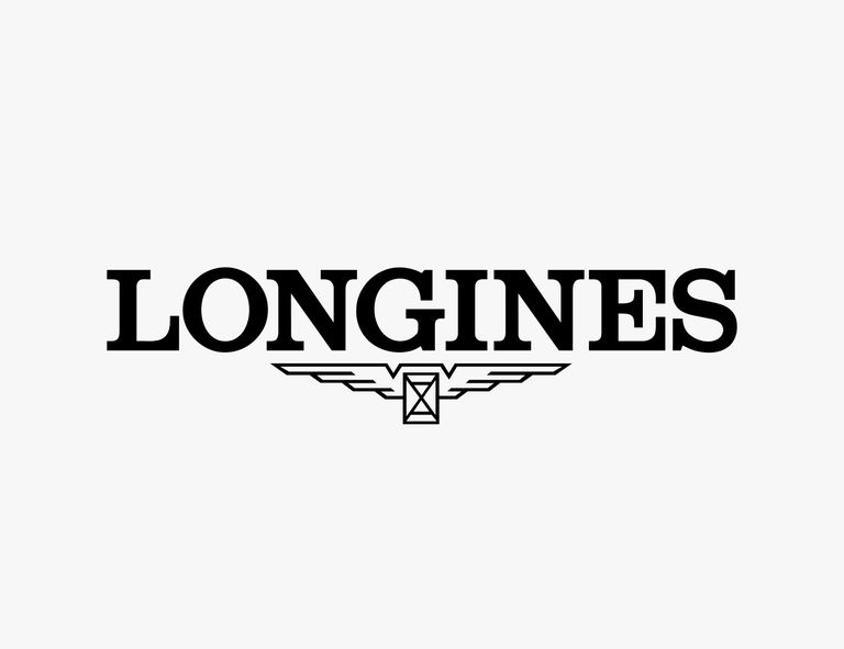
Longines proudly refers to itself as “the brand with the winged hourglass logo.” Registered in 1889, it’s said to be the oldest of its kind still in use in its largely original form (and it was apparently used even before its registration) — though it’s gone through several evolutions over the years. Featuring an “X” in a square representing an hourglass and angular wings, this is a memorable watch brand logo. It hints at the brand’s association with aviation as well as the phrase “time flies.”
Montblanc
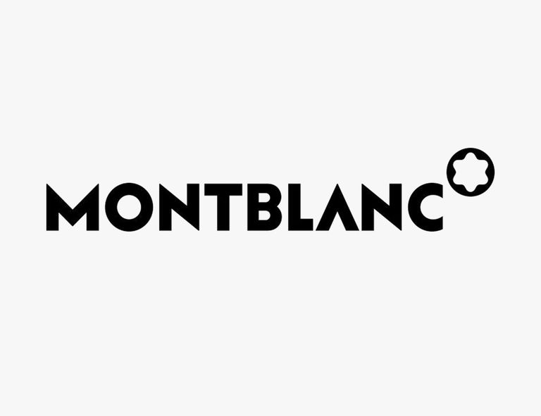
One of the most distinctive brand logos is Montblanc’s rounded, six-pointed star-in-a-circle. It’s also one of the oldest and simplest. It’s meant to represent the snowy peak of the brand’s namesake and tallest mountain in the Alps, Mont Blanc. The design dates back to 1913, only seven years after the company’s founding when it began as a pen maker. Montblanc began making watches in 1997.
Omega
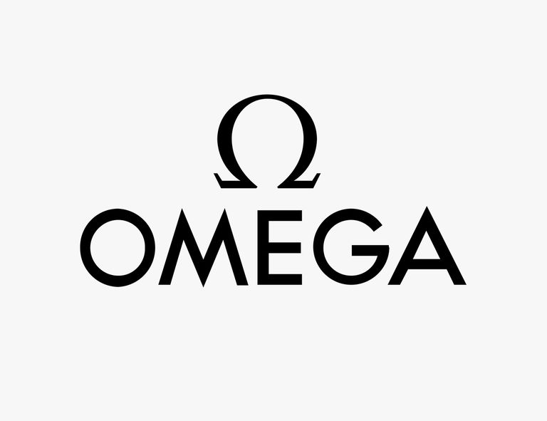
Using the omega character for its logo seems like a no-brainer, but not many people realize where the Omega name itself came from: Building upon their father’s workshop, the founder’s sons ran a watchmaking business called Louis Brandt & Fils and produced a movement in 1894 called “Omega” that was groundbreaking for its ease of service. As the last letter of the Greek alphabet, omega’s significance as “ultimate” was meant to signify the achievement. It was so successful and impressive, they adopted the name for their company.
Patek Phillippe

Founded in 1839 and one of the oldest watch companies in operation today, Patek Philippe has used its Calatrava Cross insignia since 1887. The symbol’s roots go back much further, however, as emblem of the Order of Calatrava, one of Spain’s four religious societies of knights in the 12th century. Patek’s logo is an interpretation of this symbol which comprises a cross with a fleur-de-lis motif at each of its tips. The fleur-de-lis is a stylized image based on the lily (literally, “lily flower” in French) which is a common motif in European heraldry. Calatrava was the name of a castle the knights captured, and now also the name of the watchmaker’s dress watch line.
Rolex
If you know one watch brand logo, it’s the king of watches’ unmistakable crown — and it kind of says it all. Indeed, in watch circles if you refer to “The Crown,” it’ll be understood that you mean Rolex and not the Neftlix series. With five circle-topped points and an ellipse at the bottom, the crown motif works equally well to represent the company undisputed industry dominance or as an elite status for its wearers. The company was first registered in 1908 but didn’t adopt the crown logo until 1931.
Tudor
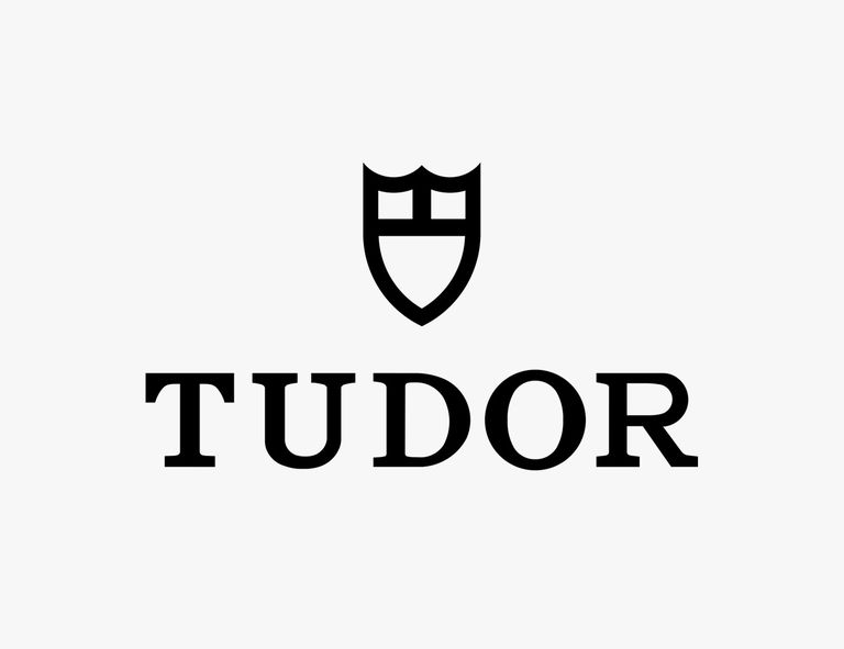
Rolex founder Hans Wildorf created Tudor in 1926 to offer more a affordable alternative to Rolex. As brands sometimes do, Tudor has changed its logo a couple of times. In its earlier days, it was a rose framed by a shield shape, but the shield disappeared in 1947, leaving only the rose — the English House of Tudor’s heraldic emblem. In 1969, the rose was replaced by a three-panel shield that remains in use today, seeming to represent a shift in focus from elegance to robust sport watches.
Ulysse Nardon

Known for marine chronometers and a history of equipping navies and shipping companies since the 1870s, Ulysse Nardin as a brand has an overarching nautical theme. The modern anchor logo, though a common motif among watch brands, therefore seems particularly appropriate. It’s taken tweaked forms over the years, from slanting designs to straight ones, but has largely remained consistent.
Vacheron Constantine
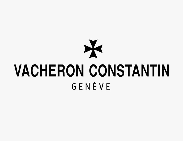
Another ridiculously old company (founded in 1755), Vacheron Constantin has a logo whose origins are similar to those of Patek Philippe’s: The design is known as the Maltese Cross for its association with the coat of arms of the Knights Hospitaller crusaders of the 12th century. Vacheron Constantin adopted it in 1880, inspired by the shape of a certain movement component. In the brand’s modern watches, you’ll see the Maltese Cross not just in the usual places brands put their logos but even influencing the likes of case and movement elements.
Tissot
Unlike many of its competitors, the Tissot watches logo has a three-color palette, which is connected with the company’s country of origin.
Seiko
What makes the Seiko watch brand stand out among many other companies is that, in spite of its long history, it hasn’t actually introduced any notable modifications into its emblem. One of the reasons why the emblem has lasted through decades is its simplicity.
Nautica

Both the clothing brand Nautica and the namesake watch brand share the same logo. It consists of the marine-inspired icon and the word “Nautica.”
Bulova
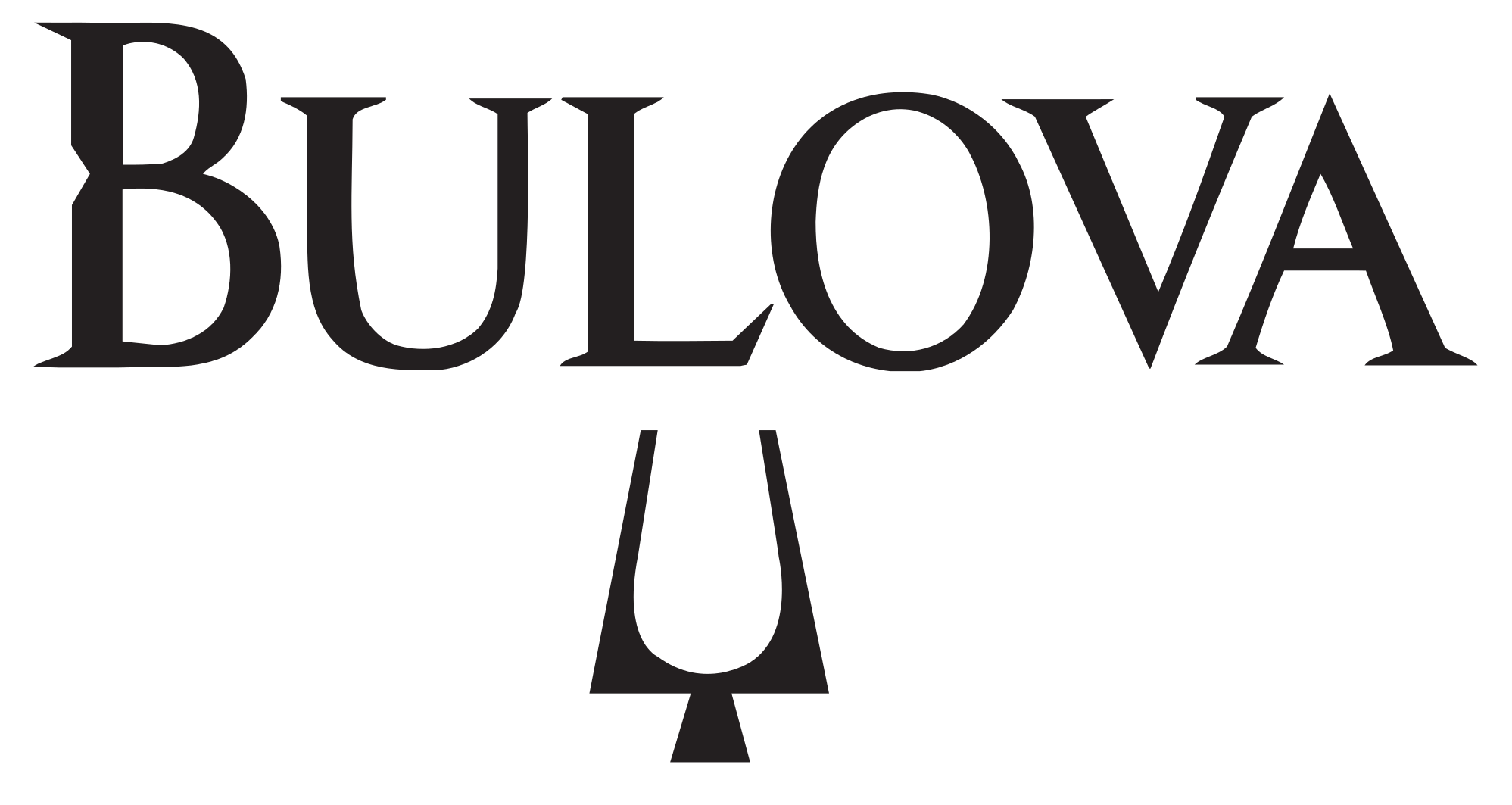
Bulova uses the tuning fork symbol that was made famous by their Accutron watches.
CHARLEY PHOTO OF THE WEEK: Even in her sleep, Charley is dreaming about licking a vanilla ice cream cone from Texas Hot.